KIN is Hong Kong's brand new sustainable food hall. KIN offers more variety and better quality in more sustainable ways. For next business stage, our aims is design the NEW App to ordering and build the relationship with customer.
User Research | Design System
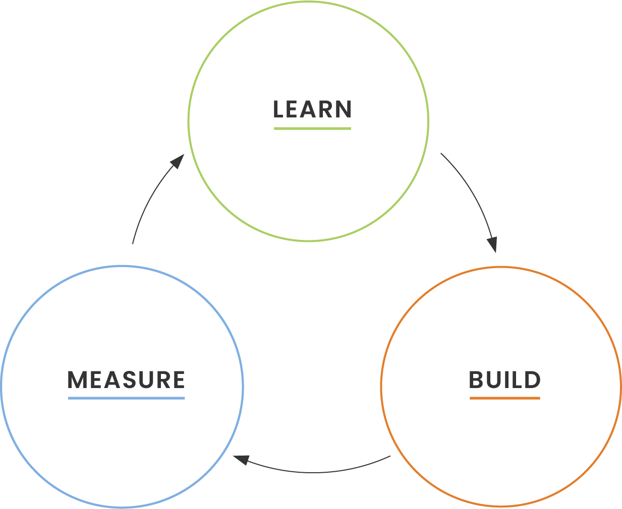
MEASURE
(Worth building more on it?)
LEARN
BUILD
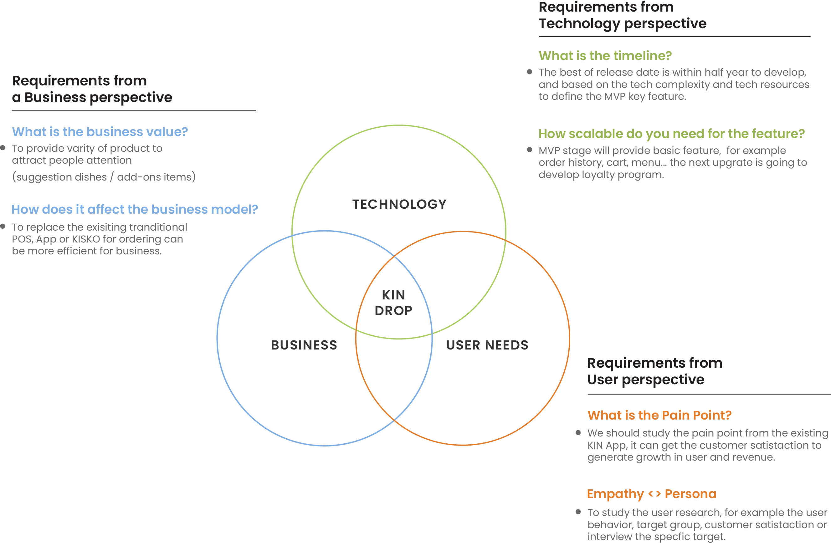
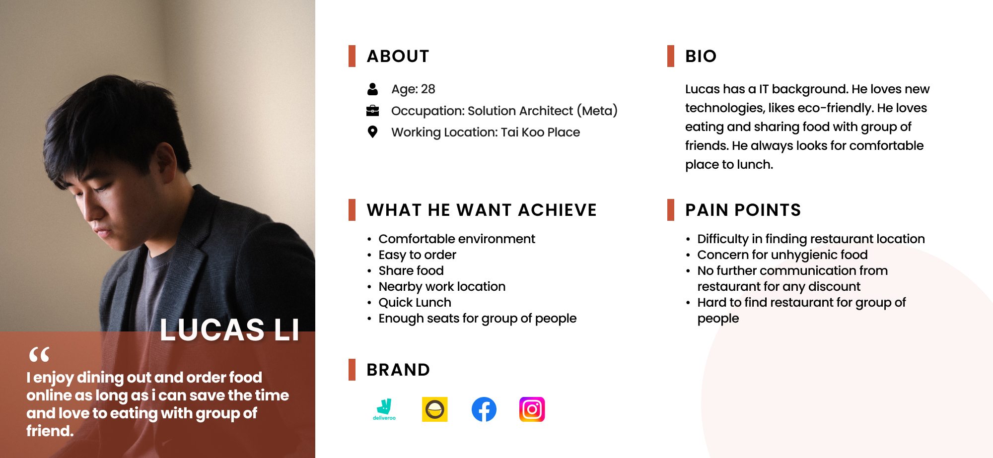
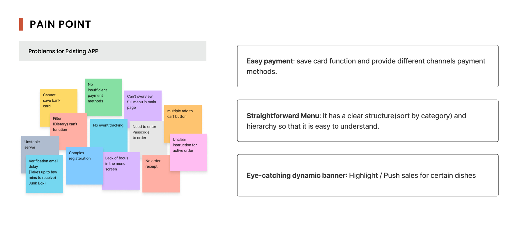
Since I wan't very familiar with this industry, I began with some secondary research to gain a better understanding of the market trends. To make sure that my decisions moving forward in the process are user-centered, I wanted to have a clear understanding of who KIN users are. I then conducted interviews to learn more about the different experiences people have had with ordering food.
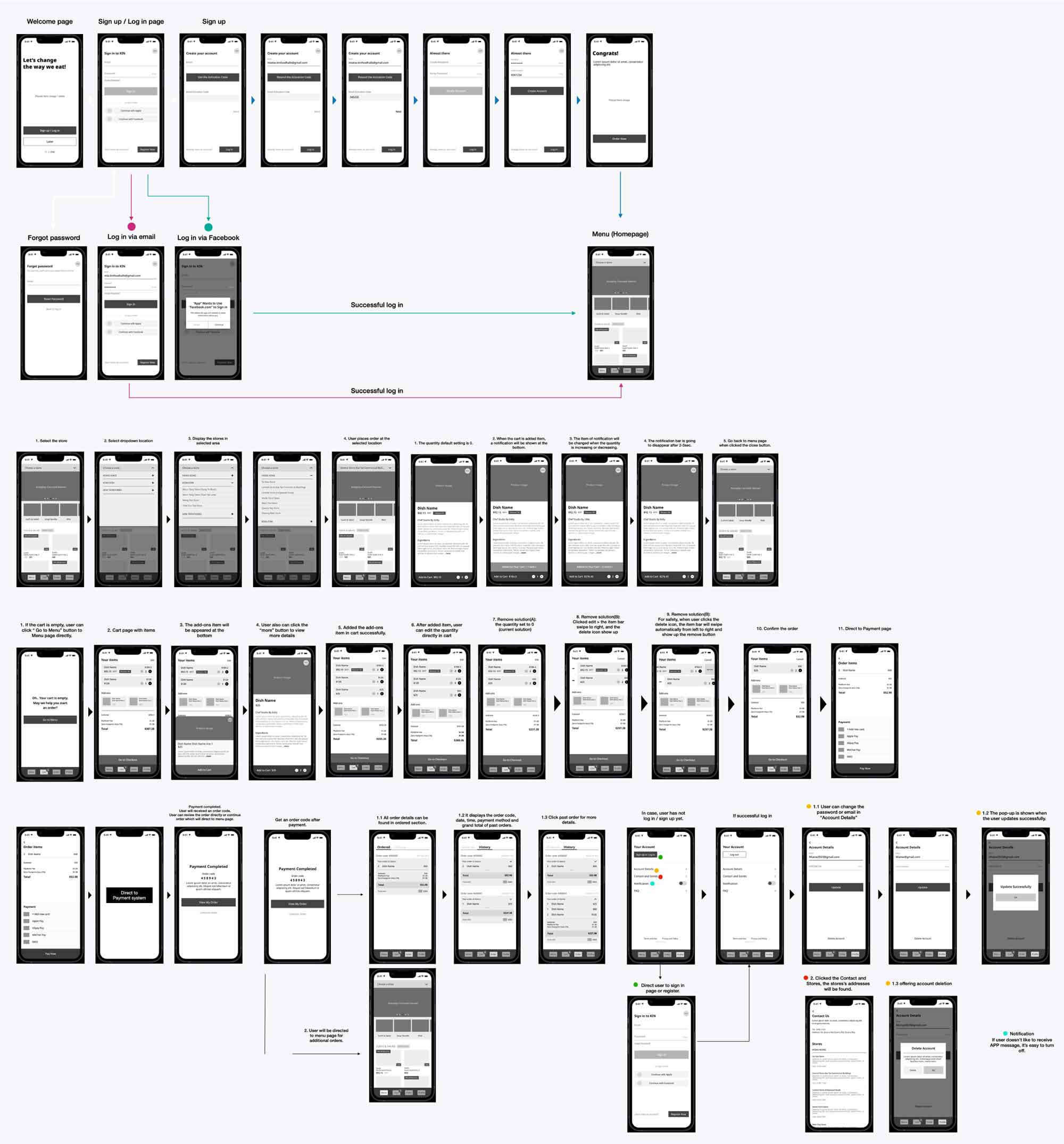
Before I start designing or building app, I created the flow diagrams first, it can help provide clarity before diving into design and development.
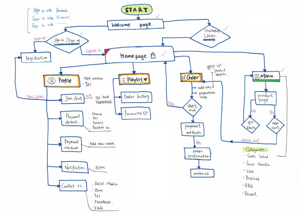
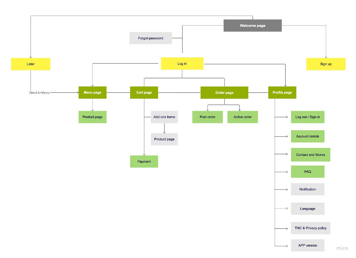
It can clear to know what will show on the screens and what can user do in these screens.
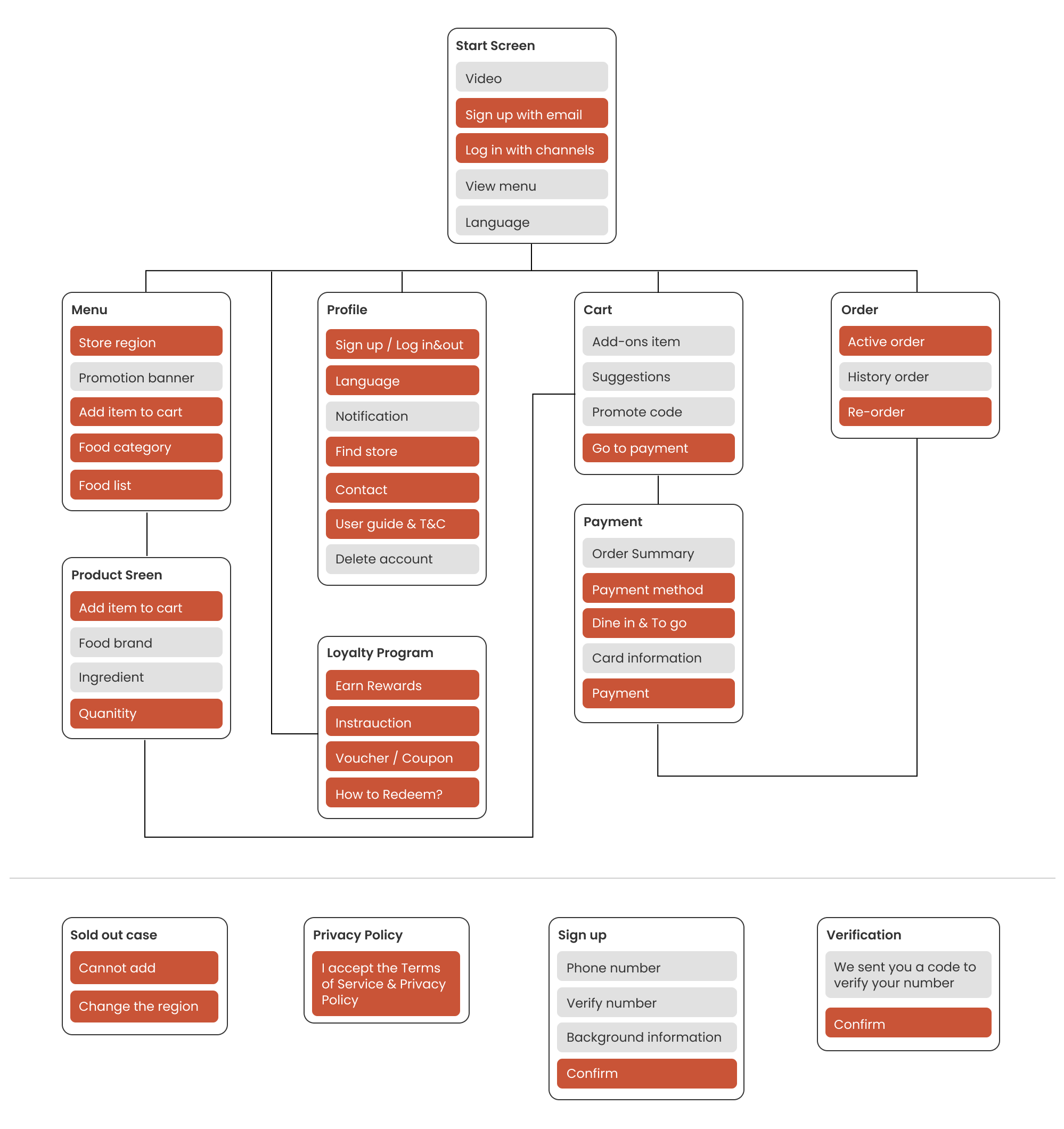
Using my understanding of the user, our goals, the architecture, and the user’s interaction with the app, I worked on making informed decisions on how to design KIN Drop screens by sketching low-fidelity wireframes.

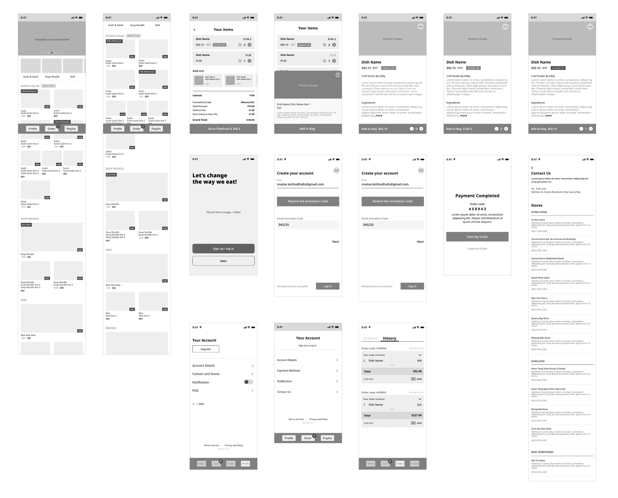
Screen flows are a combination of wireframes and flowcharts. With that information in hand, it can explain better the decisions I've made regarding the interaction design.
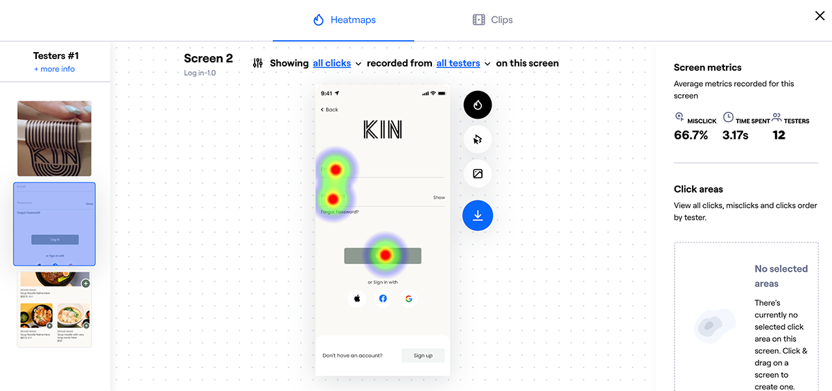
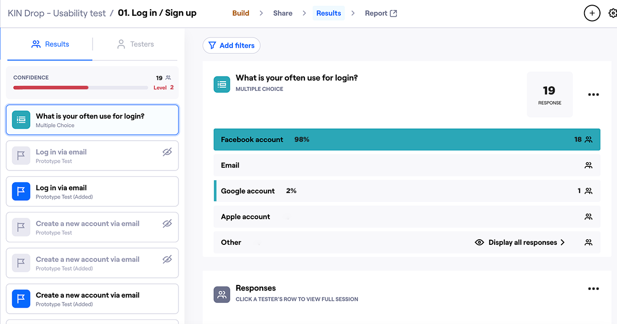
For usability testing, I created the testing / questionare by Maze. The users were asked to share what they were doing and feeling while interacting with the prototype and trying to complete the tasks given to them.
This is a screen flow, it can explain better with management and developers, make it easy to understand the component for co-worker.

UI Design
Created the design system for consistency. It makes the design workflow smoother and faster. The color, typography, spacing and many such other items clearly defined ensures consistency across the design file.

and log in account
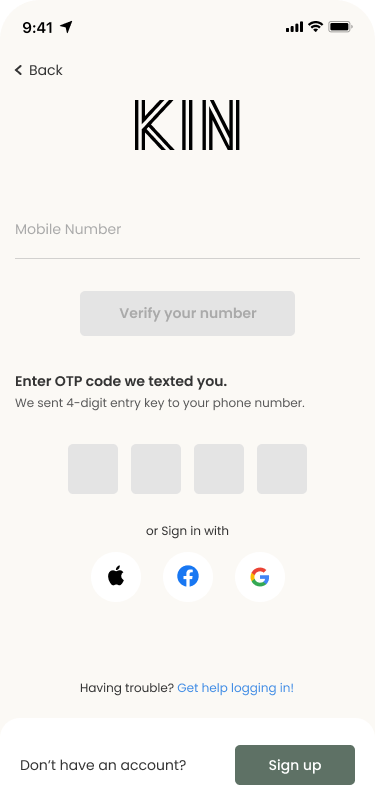
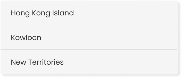
The location drop down is important for user when order the food as some stores will provide an exclusive offer or product only.
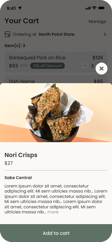
For easier to order, the category bar will be stick on top while the screen is keep scrolling.



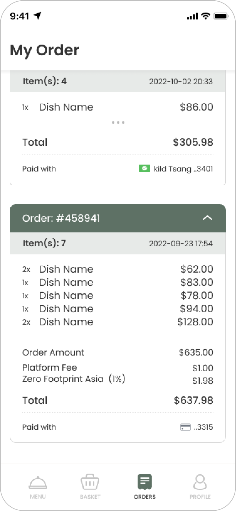
track your active order
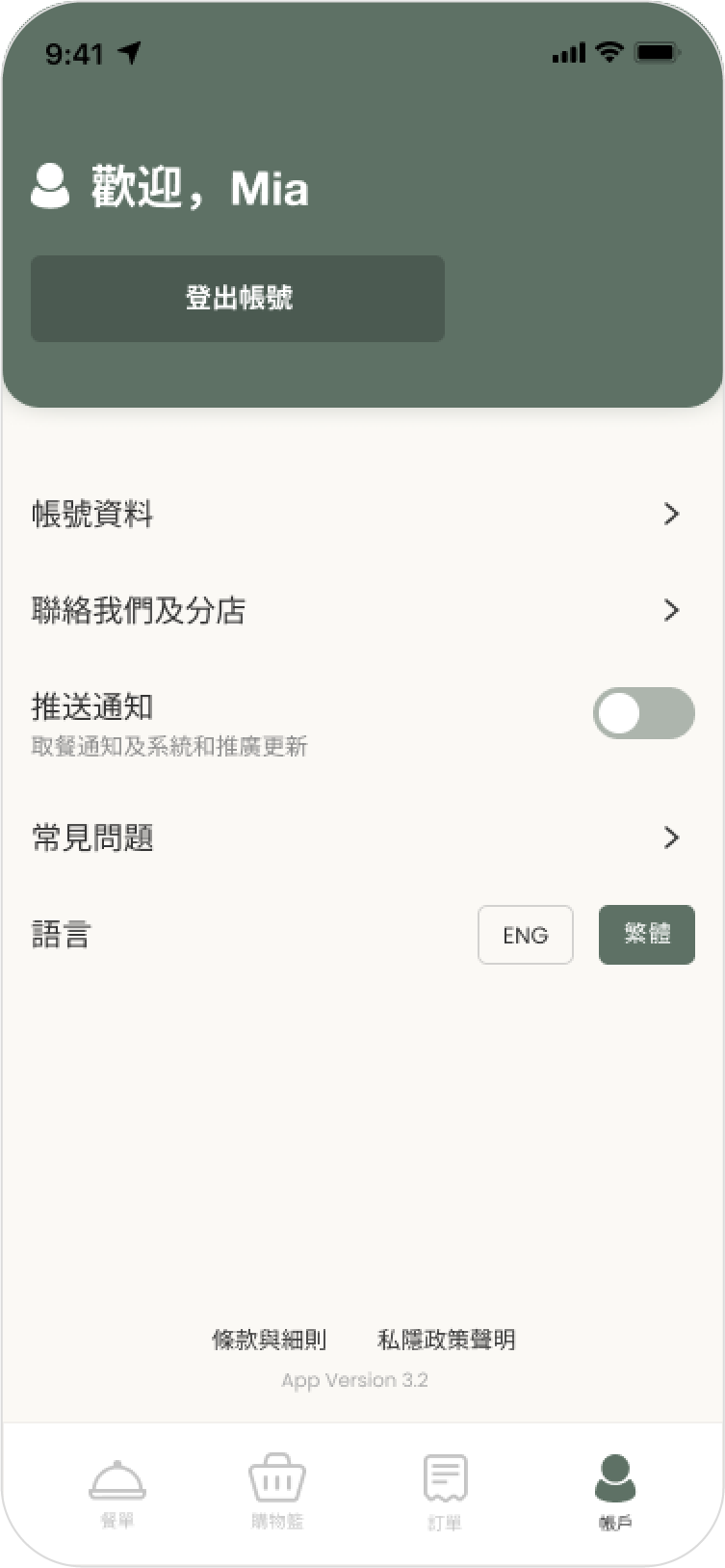
your profile
